Have you ever wondered why fast-food logos often use red and yellow?
Or why do brands like Facebook and LinkedIn lean on shades of blue?
It’s not just a coincidence—it’s color psychology in action.
Colors don’t just catch our eye; they shape how we feel, think, and behave.
Over the years, marketers have used colors to grab attention, build trust, and inspire action.
Every shade tells a story, from the calming blues of a tech giant to the fiery reds of a sale banner.
In this blog, we’ll know how color psychology in marketing is used with real examples of branding that might make you see these colors in a whole new way.
Let’s explore the colorful world of marketing together!
What is the Psychology of Color in Marketing?
Color psychology studies how different colors influence human emotions, behavior, and perceptions. It explores how colors can evoke specific feelings, influence decisions, and even shape our environments.
Unlike traditional color theory, which focuses on mixing colors, color psychology shows how colors affect us. For example, red can create feelings of passion or urgency. In contrast, blue can inspire calmness and trust.
Businesses worldwide use the psychology of color to create emotional connections, influence consumer behavior & increase their social selling strategy.
Here is a color psychology chart showing how different colors express different emotions.
Psychology of Color Chart
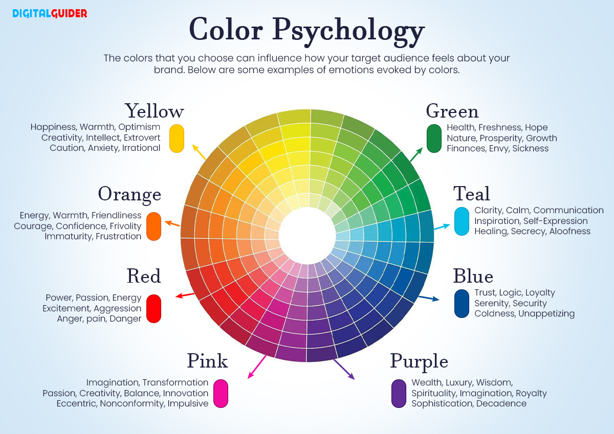
As per Shortstack data, surprisingly, 84.7 percent of people buy any product because of its color.
So, it is evident that you must strategically use colors in your branding strategy.
But which color do we use when?
Let’s learn the answer to this question & see how the psychology of each color works in marketing-
How Color Psychology Works in Branding with Examples
Color Psychology of Red
Red is a color that demands attention. Bold, energetic, and impossible to ignore, this color ranks among the most preferred in marketing.
In branding, red is all about creating emotion. It connects to passion, energy, and even love while evoking feelings of power and strength.
Ever notice how many “limited-time offers” or “flash sale” signs are in red? That’s no coincidence. It’s a color that speeds up our decision-making process.
In some cultures, red stands for love; in others, it represents luck and courage. Of course, it’s not all positive. Red can also be associated with warning or danger, meaning brands must use it thoughtfully.
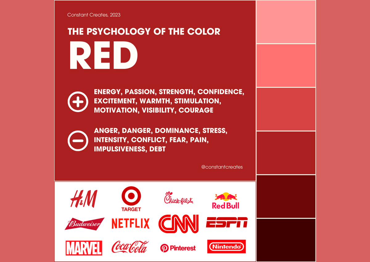
Image Source: Constant Creates
Successful Brands Using Red
- Coca-Cola – Red instantly grabs your attention and makes Coca-Cola feel exciting and refreshing. It sparks joy and energy, exactly what you want in a beverage that promises happiness.
- Kellogg’s –Kellogg’s uses red to evoke hunger. It makes their products feel cozy and familiar, a comforting start to your day.
- Netflix – Ever feel the rush of excitement when you spot the red Netflix logo? That’s because red is all about grabbing attention and sparking interest.
- YouTube – YouTube uses red to do precisely what it needs: make you click. The bold color creates a sense of urgency, encouraging you to watch that next viral video or check out a new channel.
Next time when you redesign your website or plan a campaign, remember to use red. It can help grab the attention of your brand.
Color Psychology of Yellow
Yellow is the color of optimism. It’s bright and cheerful, full of energy. This makes it a favorite for brands that want to grab attention and create positivity.
Yellow also stimulates mental activity, making it an excellent color for industries promoting clarity and focus.
But like any color, yellow has its nuances. While it’s primarily associated with positivity, too much yellow can be overwhelming or even cause anxiety. That’s why brands must use it in moderation, balancing it with other colors to create the right effect.
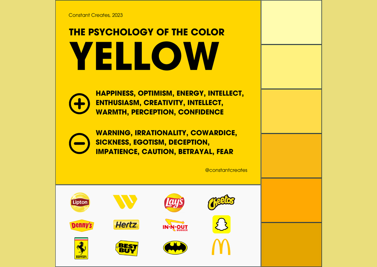
Image Source: Constant Creates
Successful Brands Using Yellow
- McDonald’s – Yellow in McDonald’s branding is about making customers feel happy and welcome. It creates a fun, energetic atmosphere, drawing in people ready to enjoy a meal.
- Best Buy – Yellow makes Best Buy’s offers pop! It conveys a sense of urgency, making you feel you can’t miss out on those fantastic deals.
- IKEA uses yellow to create a sense of fun and creativity, inviting customers to explore their store and discover new ideas for home design.
- Snapchat – Yellow is the perfect fit for Snapchat. It’s playful, youthful, and energetic, which aligns perfectly with the app’s fun and dynamic personality.
Color Psychology of Blue
Marketers often choose blue as their favorite color. It is seen as calming and trustworthy. Blue creates a sense of peace and stability.
Unlike red’s energetic vibe, blue is about relaxation and trust. This makes blue a popular choice in branding. It inspires confidence and loyalty.
Blue is often linked to feelings of calm, wisdom, and security. It also connects with trustworthiness, which is why banks, tech companies, and healthcare brands commonly use it.
Blue carries universal meanings; people often associate it with calmness, peace, and loyalty across cultures.
It establishes a connection that makes people feel comfortable and safe, creating strong brand loyalty.
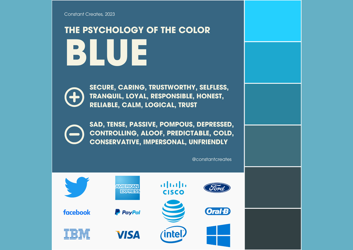
Image Source: Constant Creates
It establishes a connection that makes people feel comfortable and safe, creating strong brand loyalty.
Successful Brands Using Blue
- Facebook – Blue gives Facebook a calm, dependable feel, making users trust the platform with their connections and data.
- IBM – With its iconic blue logo, IBM conveys professionalism and innovation, building confidence in its cutting-edge technology.
- Visa – Blue in Visa’s branding evokes security and trust, which are essential when handling financial transactions.
- Twitter – The Blue on Twitter’s logo encourages communication, making the platform feel open and welcoming while maintaining professionalism.
Color psychology of Purple
Entitled as a ‘regal color,’ purple is the color of mystery and luxury. It’s both regal and calming, creating a sense of sophistication that stands out without being overwhelming.
Think about the last time you saw a premium brand using purple—didn’t it instantly feel more high-end?
Purple is all about creating a feeling of elegance and exclusivity. It’s a color that blends the calm of blue with the energy of red, making it perfect for brands aiming to project creativity, luxury, and wisdom.
Purple symbolizes spirituality and ambition, adding depth to any brand’s identity.
In many cultures, it’s seen as a symbol of royalty and power. That’s why brands often use it to create a sense of premium quality.
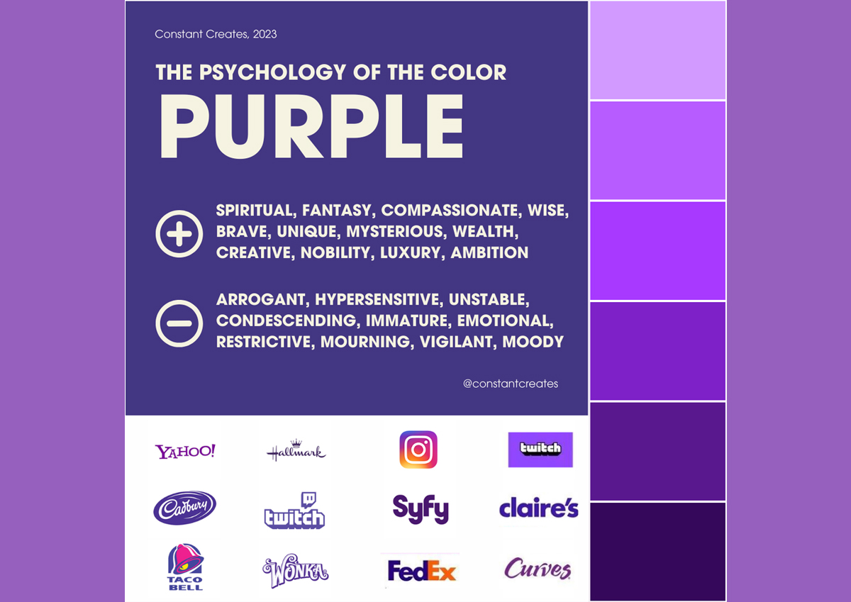
Image Source: Constant Creates
Successful Brands Using Purple
- T-Mobile – The bold purple of T-Mobile isn’t just about visibility; it screams innovation and modernity, making the brand feel fresh and customer-focused.
- Hallmark – Purple in Hallmark’s branding evokes warmth and nostalgia, bringing a sense of emotional connection and trust with every greeting card.
- Yahoo! – The deep purple in Yahoo!’s logo speaks to its status as a longstanding, creative tech company, blending fun with sophistication.
Color Psychology of Orange
With a vibrant & energetic vibe, orange screams enthusiasm and creativity. Its bold, playful, and warm qualities make it a favorite choice for branding that aims to stand out and get noticed.
People associate orange with joy, optimism, and adventure, sparking feelings of friendliness and warmth.
You often see it on call-to-action buttons, sales banners, and limited-time offers. It grabs attention but does not feel aggressive.
If you want to bring youthful energy to your brand, orange is your color. It makes your brand feel fresh, fun, and friendly.
Image Source: Constant Creates
Successful Brands Using Orange
- Fanta – Orange is the perfect fit for Fanta, bringing an explosion of fun and excitement. It sparks joy and energy, making the brand feel refreshing and playful.
- Nickelodeon – You can’t help but smile when you see the vibrant orange of Nickelodeon. The color evokes a sense of adventure and creativity, attracting kids and families to their content.
- Home Depot – Orange makes Home Depot feel accessible and friendly. It draws people in with a warm, welcoming vibe while motivating them to take on new DIY projects.
Color Psychology of Green
Green is the color of growth, renewal, and calm. Often seen as a symbol of balance and harmony, many brands use it to create a sense of peace, health, and sustainability.
Excluding the vision of relaxation and grounding, green is a favorite for brands/companies associating with nature, fresh air, and well-being.
In branding, many companies often use green to communicate health, wellness, and eco-conscious values.
Green also represents stability and prosperity, making it a favorite in finance and real estate industries where trust is critical. It gives the feeling of security and success, so you’ll often see it in logos for banks or investment firms.
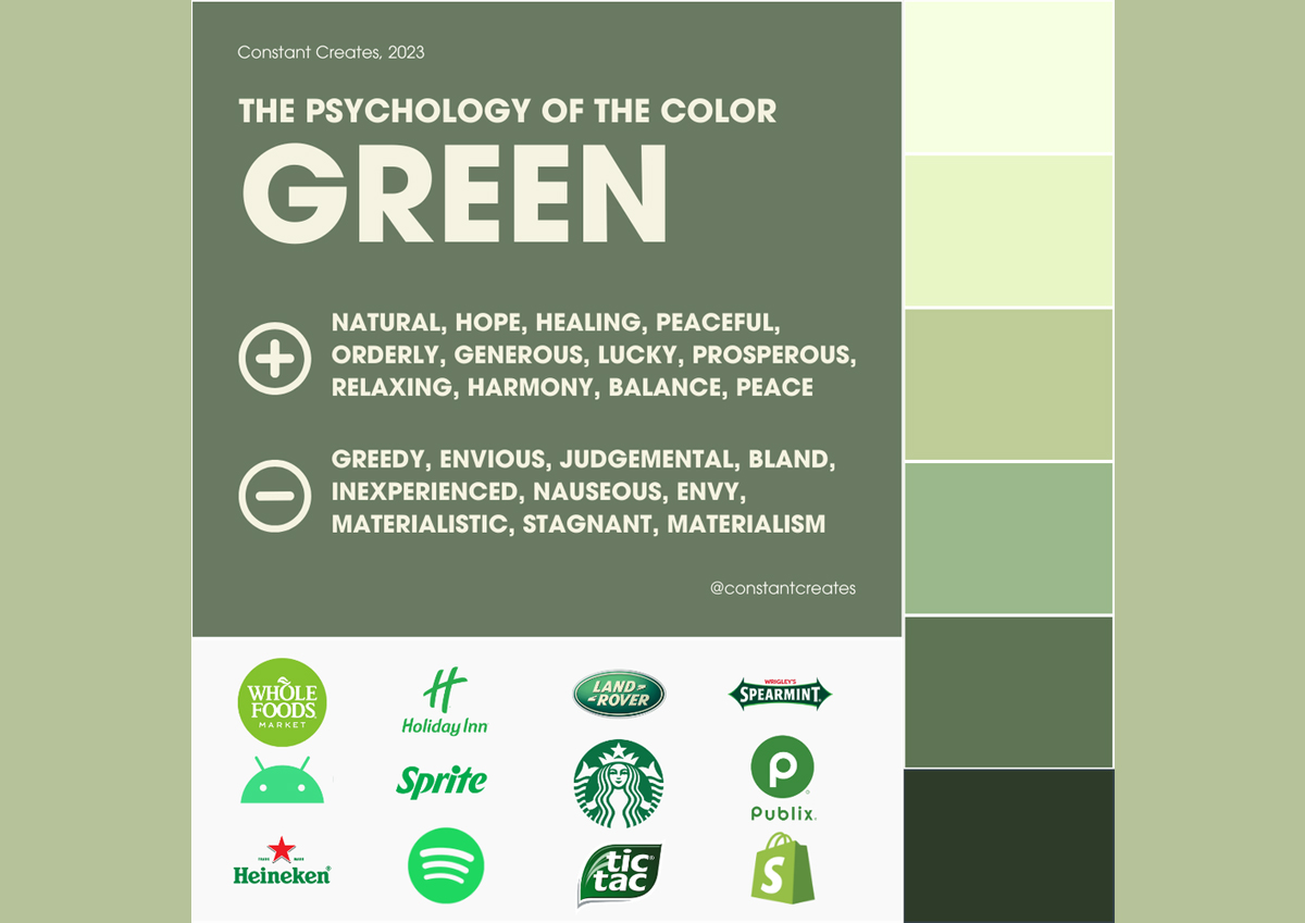
Image Source: Constant Creates
Successful Brands Using Green
- Whole Foods – Green embodies the brand’s commitment to healthy, sustainable living, inviting customers to embrace a wholesome lifestyle.
- Starbucks – Using green in Starbucks’ logo connects the brand to a natural, fresh vibe, making your coffee experience feel comforting and energizing.
- Tropicana – Green reinforces the idea of freshness and natural ingredients, making consumers feel good about their choices.
In short, green is a color that speaks to our need for balance and renewal. It’s calming, refreshing, and trustworthy—making it a perfect choice for brands that want to leave a positive and lasting impression.
Color Psychology of Black
Being the first color used by humanity, black is deeply rooted in history and science.
The ever-powerful, sleek, and timeless color is often used to showcase sophistication and mystery.
Black is about making a statement. It’s the color of strength, authority, confidence, elegance, and simplicity. It can evoke a sense of power while maintaining a refined, understated look.
High-end brands like Chanel or Apple use black to communicate luxury and style, drawing customers into a world of exclusivity.
Black also gives a sense of seriousness and professionalism, which is why many corporate brands love it. It’s a color that conveys reliability, trustworthiness, and expertise.
In some cultures, black symbolizes mourning, while in others, it represents power and formality. It’s a color that holds different meanings across the globe, so when using it in branding, context is critical.
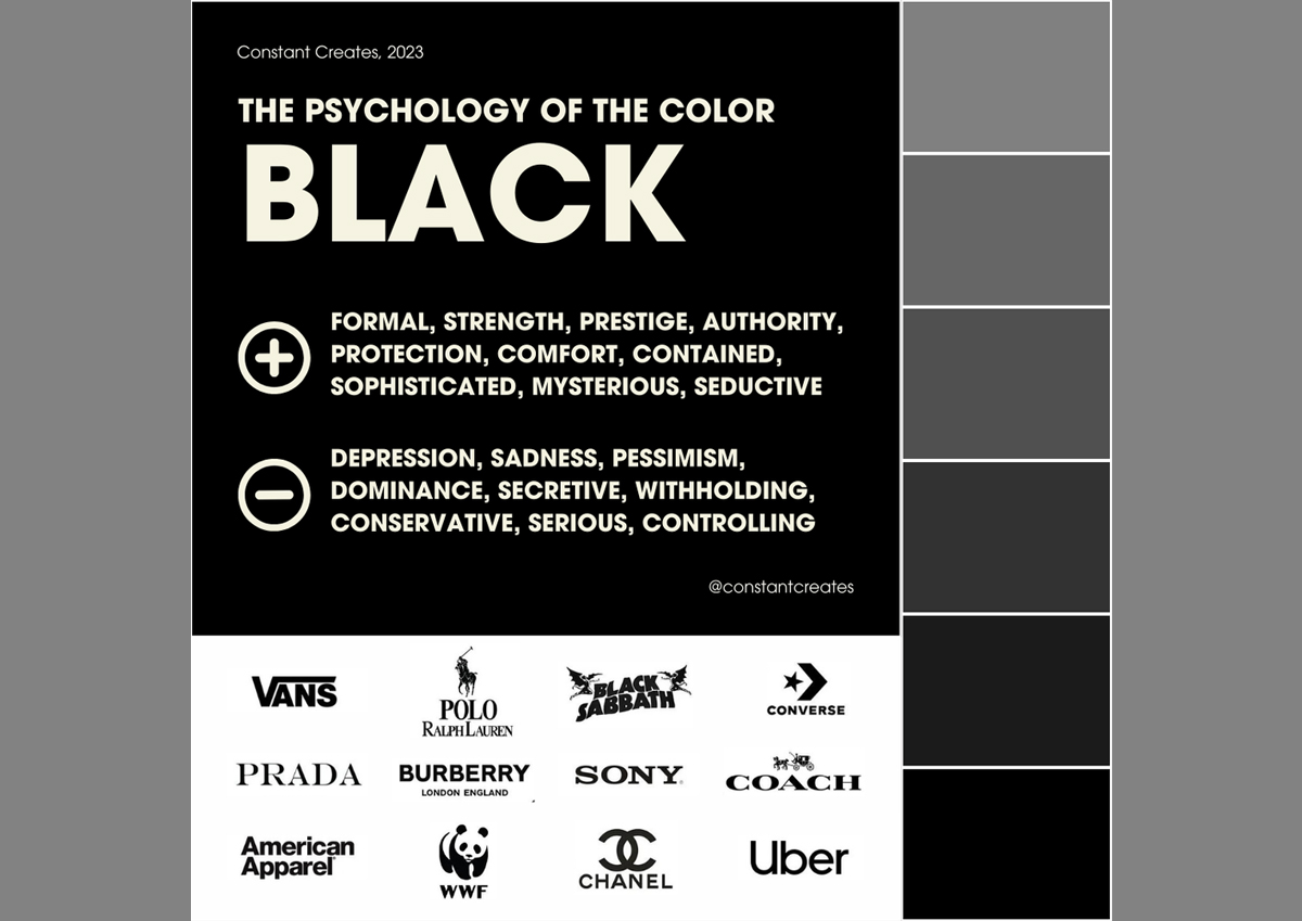
Image Source: Constant Creates
Successful Brands Using Black
- Chanel – Black speaks luxury, elegance, and timeless style, perfectly matching the high-end fashion world Chanel represents.
- Apple – The sleek black of Apple products gives off a sense of cutting-edge technology and high-quality design.
- Nike – Black in Nike’s branding conveys strength, authority, and athleticism—making the brand feel powerful and elite.
- Rolex – A black watch face says sophistication and luxury, positioning Rolex as the symbol of success.
Use Psychology of Color in Marketing Strategy
And there you have it—color isn’t just a pretty detail; it has the power to change petty consumer decisions.
From red’s bold, attention-grabbing power to white’s clean, minimalist charm, your color choices shape how people feel about your brand.
So, what’s your brand color saying to your audience? Whether you’re ready to revamp your brand or just tweak it, choosing the right color can make a huge impact.
Want to make it even better?
Choose colors that match an excellent website design that connects with your audience. Also, improve your content marketing. This will ensure your brand message is as vibrant as your visuals.
Always test your color choices. A/B testing helps you see how your audience responds to different colors and layouts. This guides you to get the best results for leads and traffic.
The post How Color Psychology is Used in Marketing (With Real Examples) appeared first on DigitalGuider.
Source: digitalguider.com
